Posted: Friday 12 March 2021
Edgbaston Series – Formal Lounge

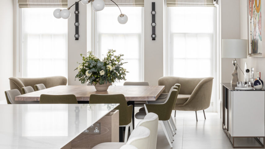
This week we are excited to share more details on the design and reconfiguration at our Edgbaston residence, we are focusing on the Formal Lounge and will be sharing more design details over the next few weeks. Head over to our previous post if you would like to read more about the reconfiguration of the Kitchen & Dining Area – Click Here.
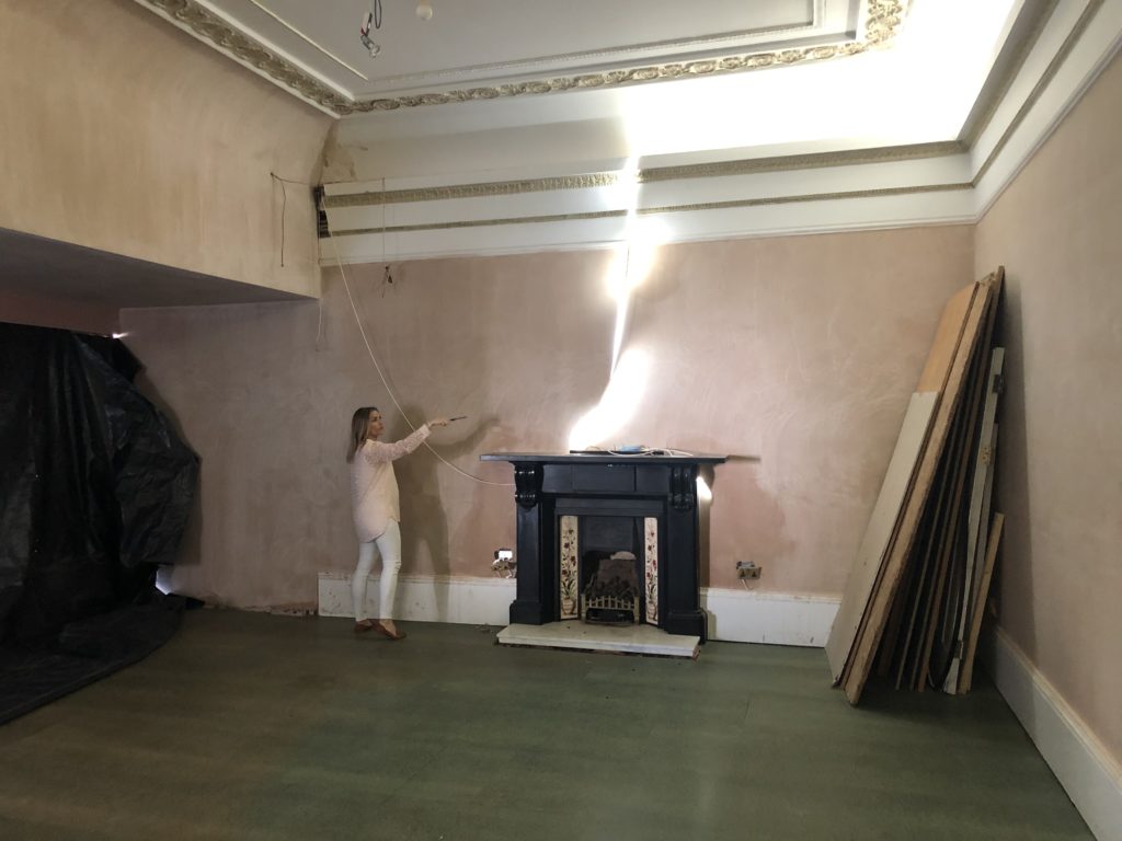
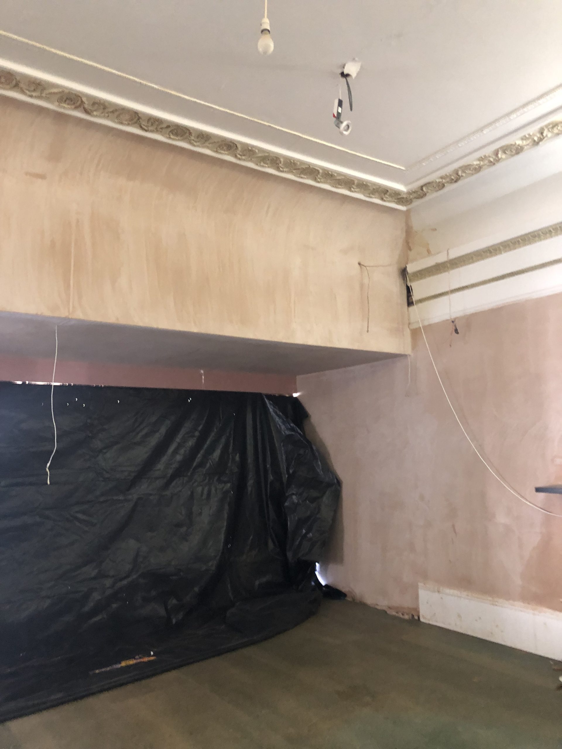
Before
When we first visited the property, this room felt a bit forgotten. It was partly refurbished & being used for storage. We felt this room needed a lot of attention and immediately had grand plans for the space. We wanted this room to have a slightly more formal feel to the family room whilst maintaining comfort & functionality.
When the previous owners extended this room there was a large bulkhead which was over a meter lower than the main ceiling, this was due to the flat roof and terrace above. When you entered the room, this was the first thing you were welcomed with, which we felt was a little oppressive and did not flow with the other proportions of the room, and not a focal point we wanted to retain.
After
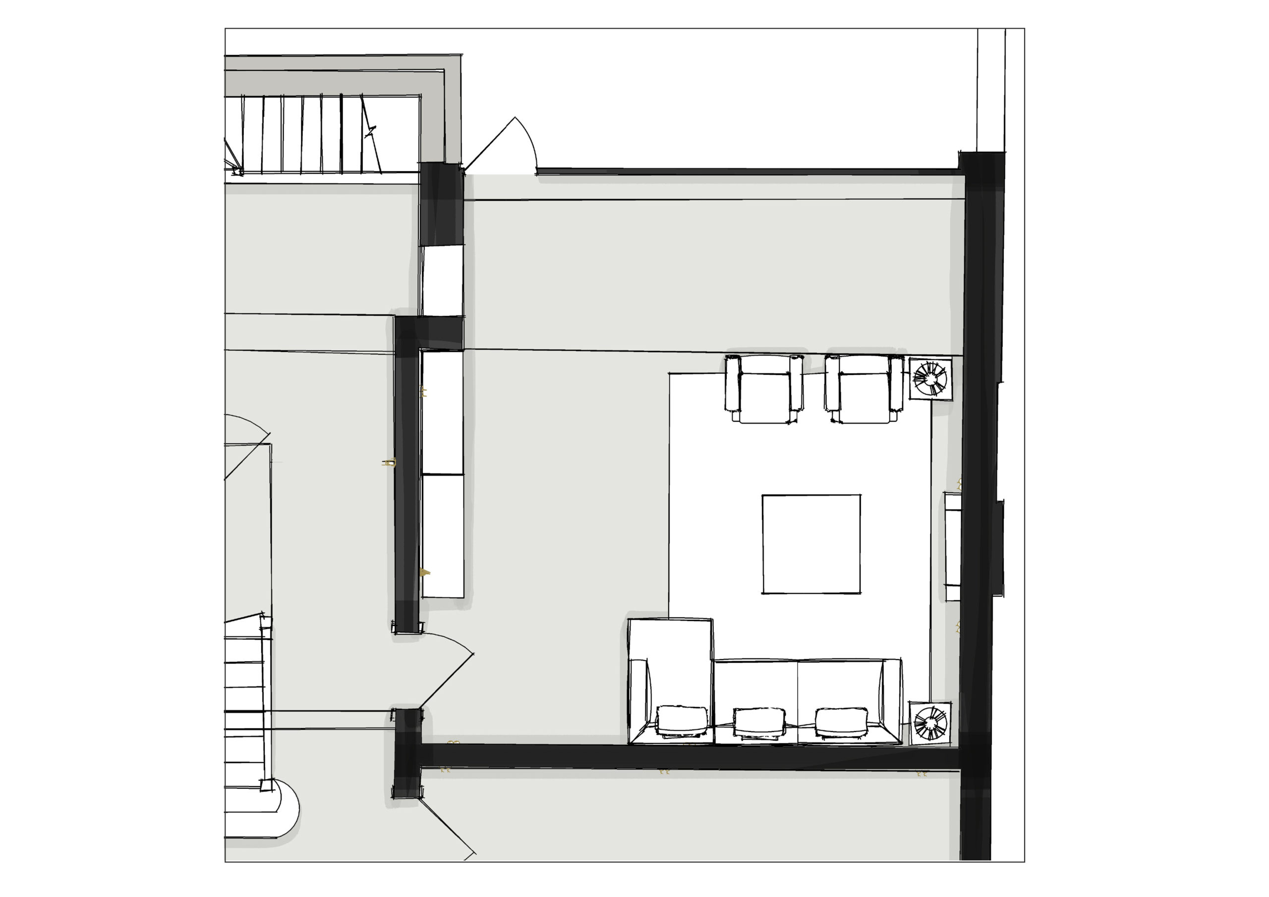
We started by making some architectural changes to the space, there was an opening on the opposite side which housed a fish tank, so we decided to move the door to the opposite side as there was already an opening there. We then blocked up the existing entrance, we felt this was crucial to the space planning. When you enter through the new door you are immediately welcomed with the increasing height which draws you into the space. To make the bulkhead feel more included within the design, we designed a custom linear strut divider and panelling which creates soft shadows and a calming atmosphere.
We included the door within the panelling to have a ‘secret’ feel while subtly blending into the strut detail of the wall. Another benefit to the repositioning of the door allowed for a much more interactive layout.
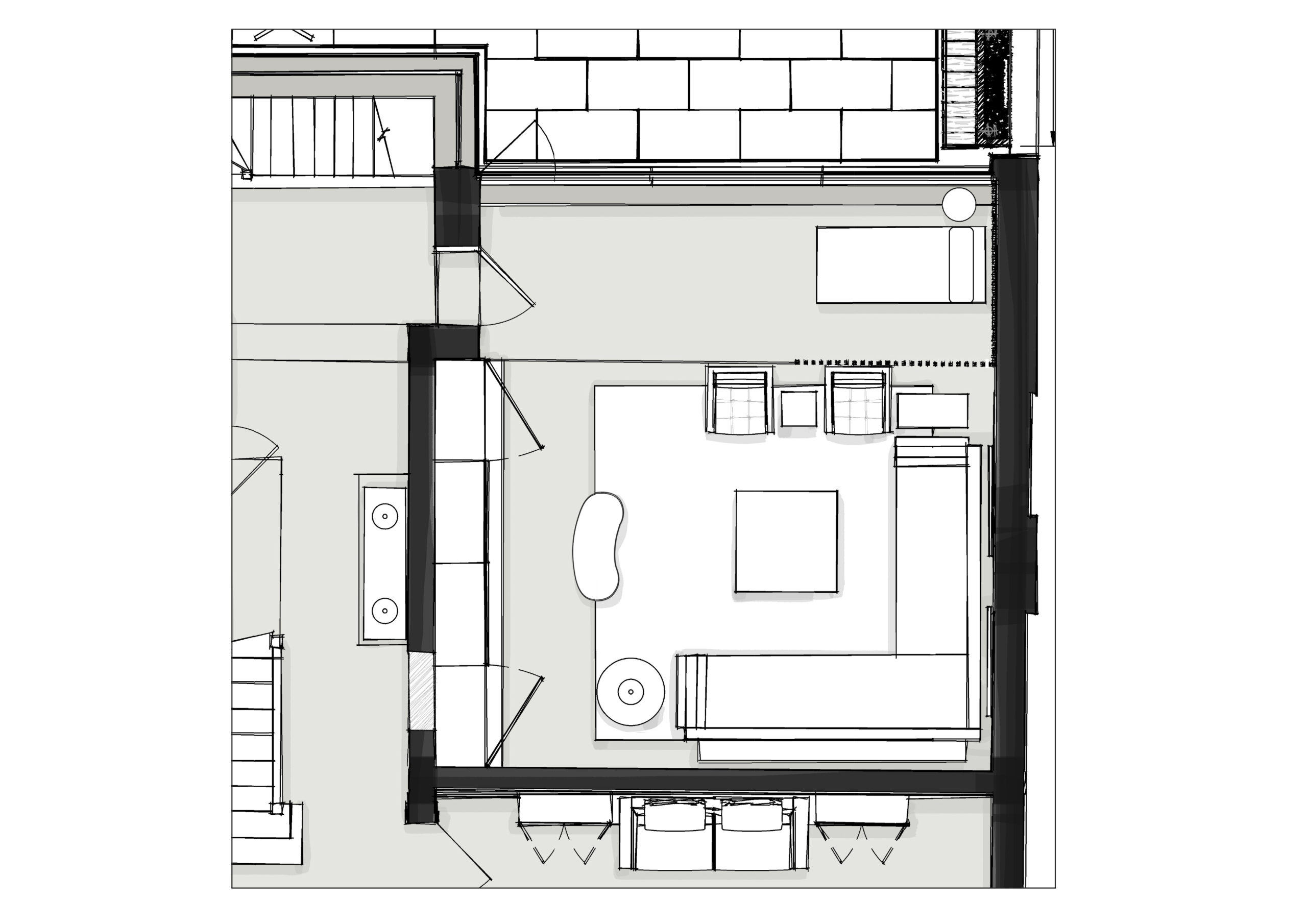
We also made the decision to remove the fireplace, we would usually keep any period or architectural features, but we unfortunately could not make the layout work with the fireplace being positioned on the back wall and our clients wanting a TV in this room. We did install a beautiful stone fireplace surround and new fire in the home office though!
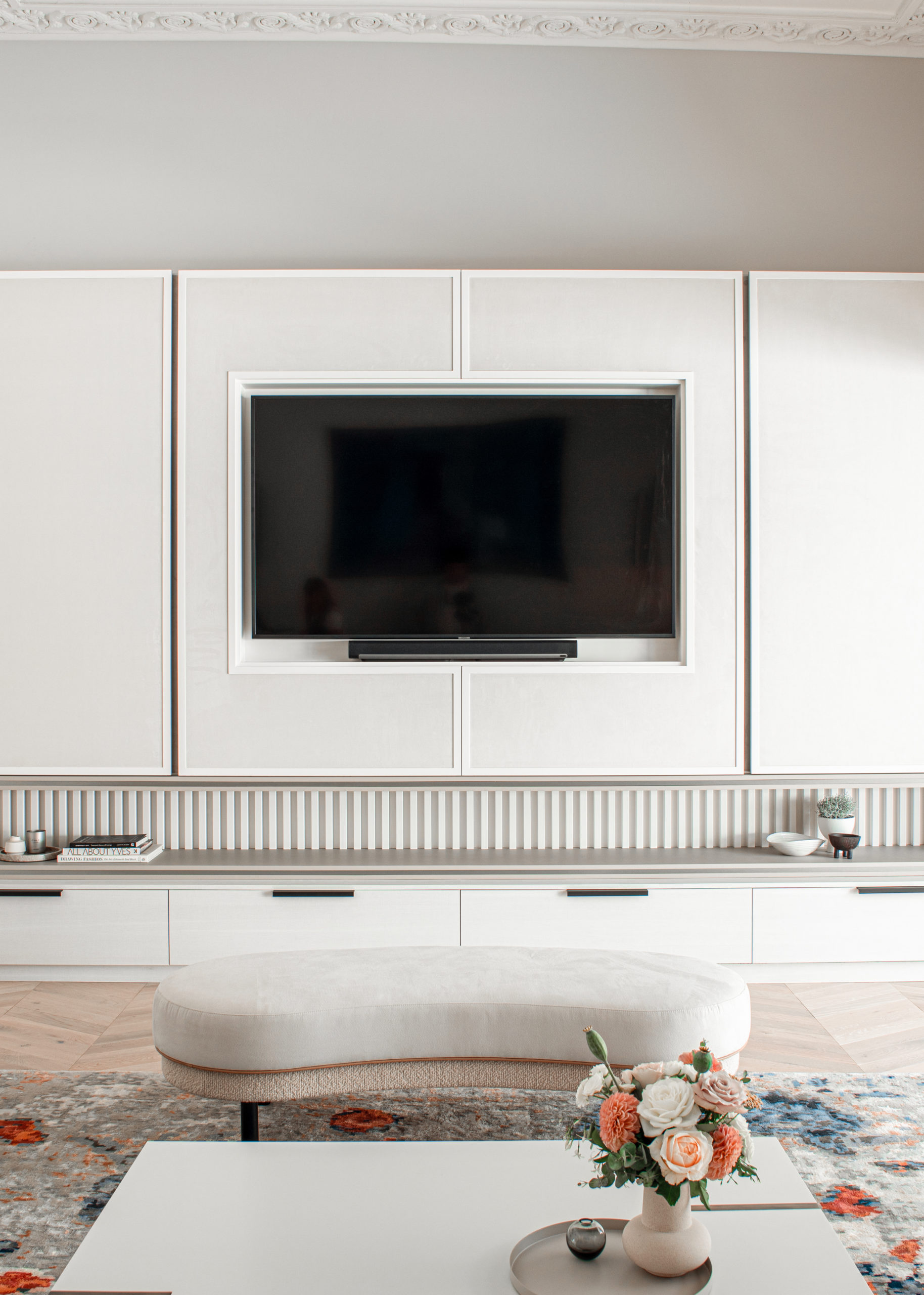
Nowadays TV’s are an integral part of life experience & they have a big role in a lot of family’s everyday life. We designed & integrated this TV into a beautiful arrangement of bespoke cabinetry which spans the whole wall in this Living space, creating a new focus and a sociable and flexible seating area.
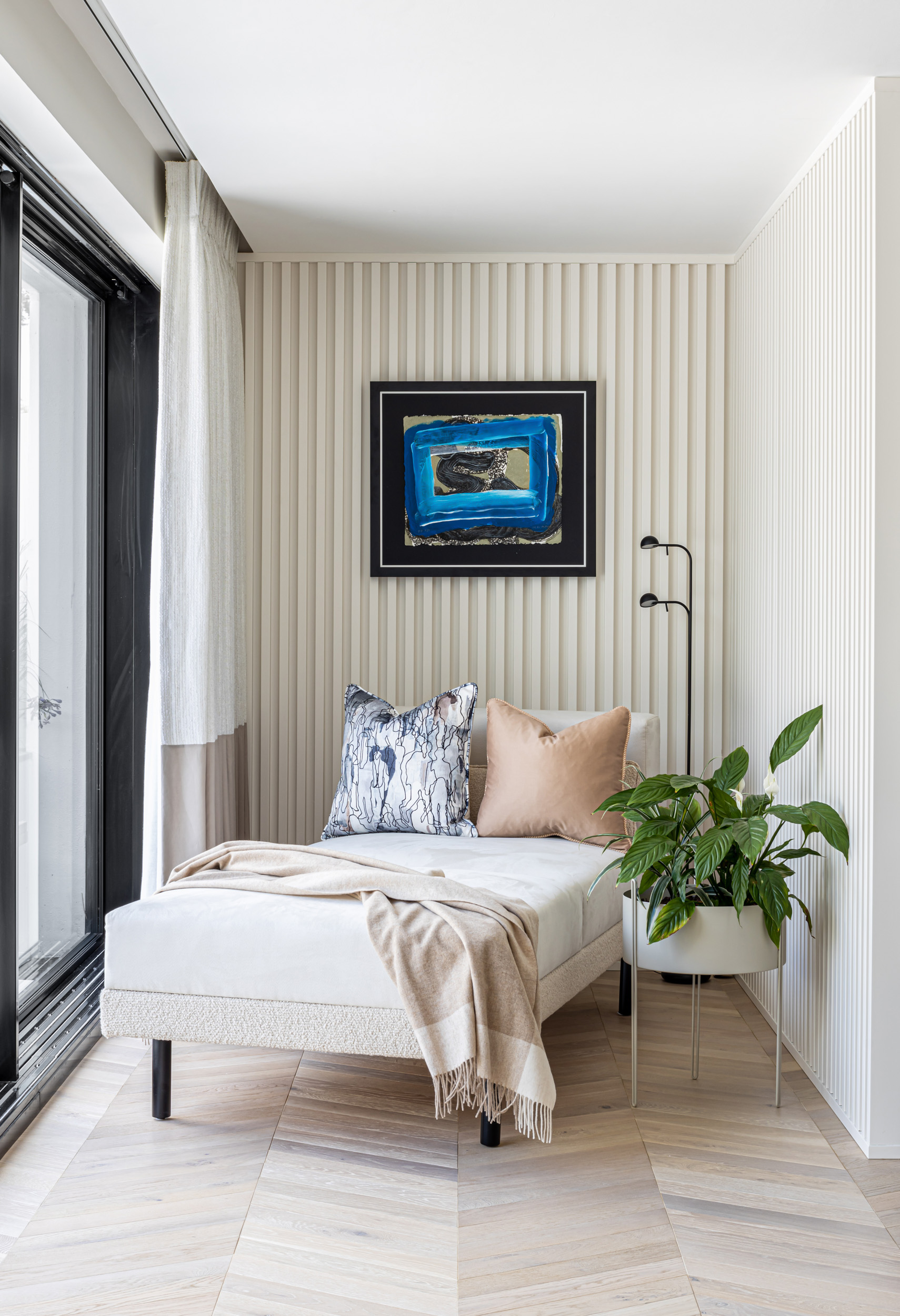
Our design concept was to make the bulkhead feel integral to the interior space planning, one way we did this was to create different zones. Dividing the space using a linear timber strut divider, which enabled us to create a separate seating area featuring a daybed which then created a perfect spot for enjoying the beautiful, landscaped garden. The new layout of the room allowed us to integrate a mixture of furniture shapes adding to the sociable nature of the room.
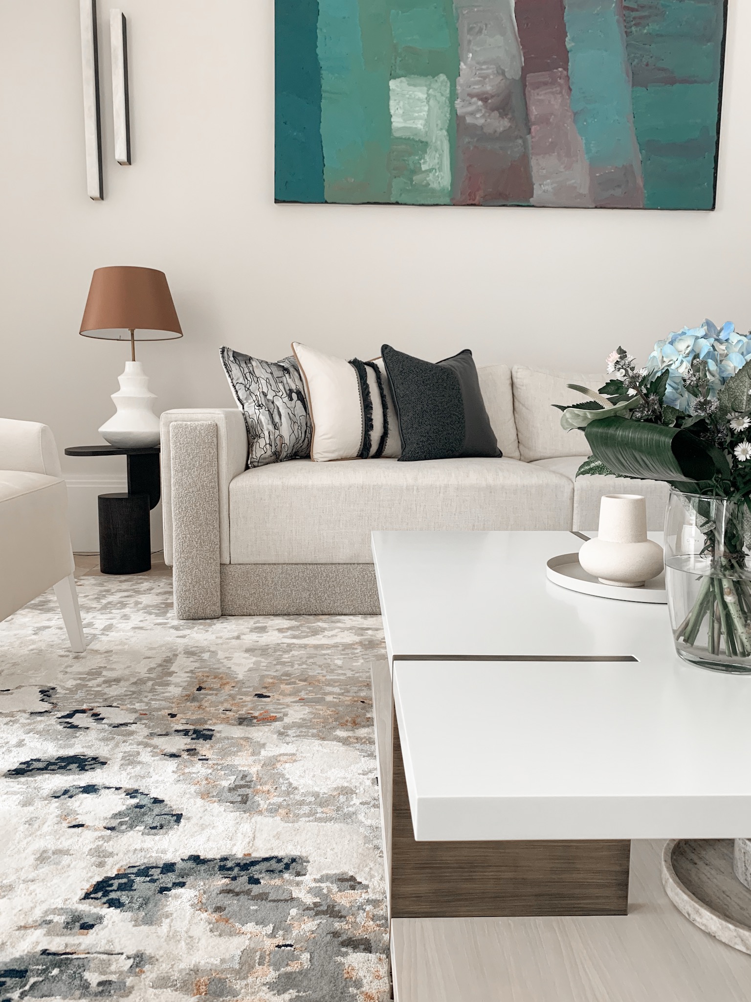
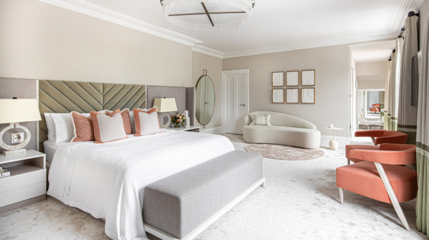
We used a very light palette with soft peaches and blues and loads of texture!⠀
Next time we will be looking at how we created a new master suite, featuring his and hers ensuites and interlink dressing rooms.
If you would like to know more head over to our contact page and leave us a message!
