Posted: Friday 26 February 2021
Edgbaston Series – Dining Room

Today we are excited to share more details on the design and reconfiguration at our Edgbaston residence, we’re focusing on the kitchen & dining area and will be sharing more design details over the next few weeks.
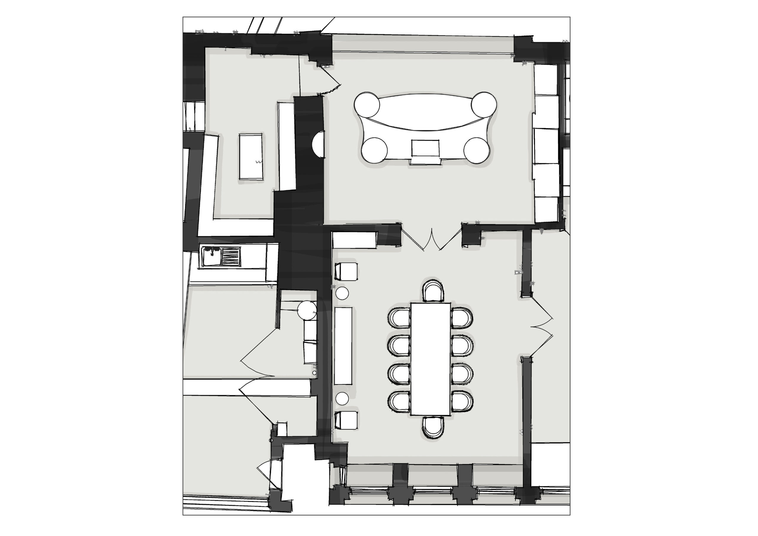
Before
This project is a rare example where no architect was appointed, we solely planned the reconfiguration of this project. Throughout this project we have opened up & closed off spaces, moved doorways & added doorways, working closely with the contractor and a structural engineer.
Our designer’s passion for architectural detail means that we always begin from a point of analysis, and the existing layout did not meet with our clients’ needs or expectations of the property.
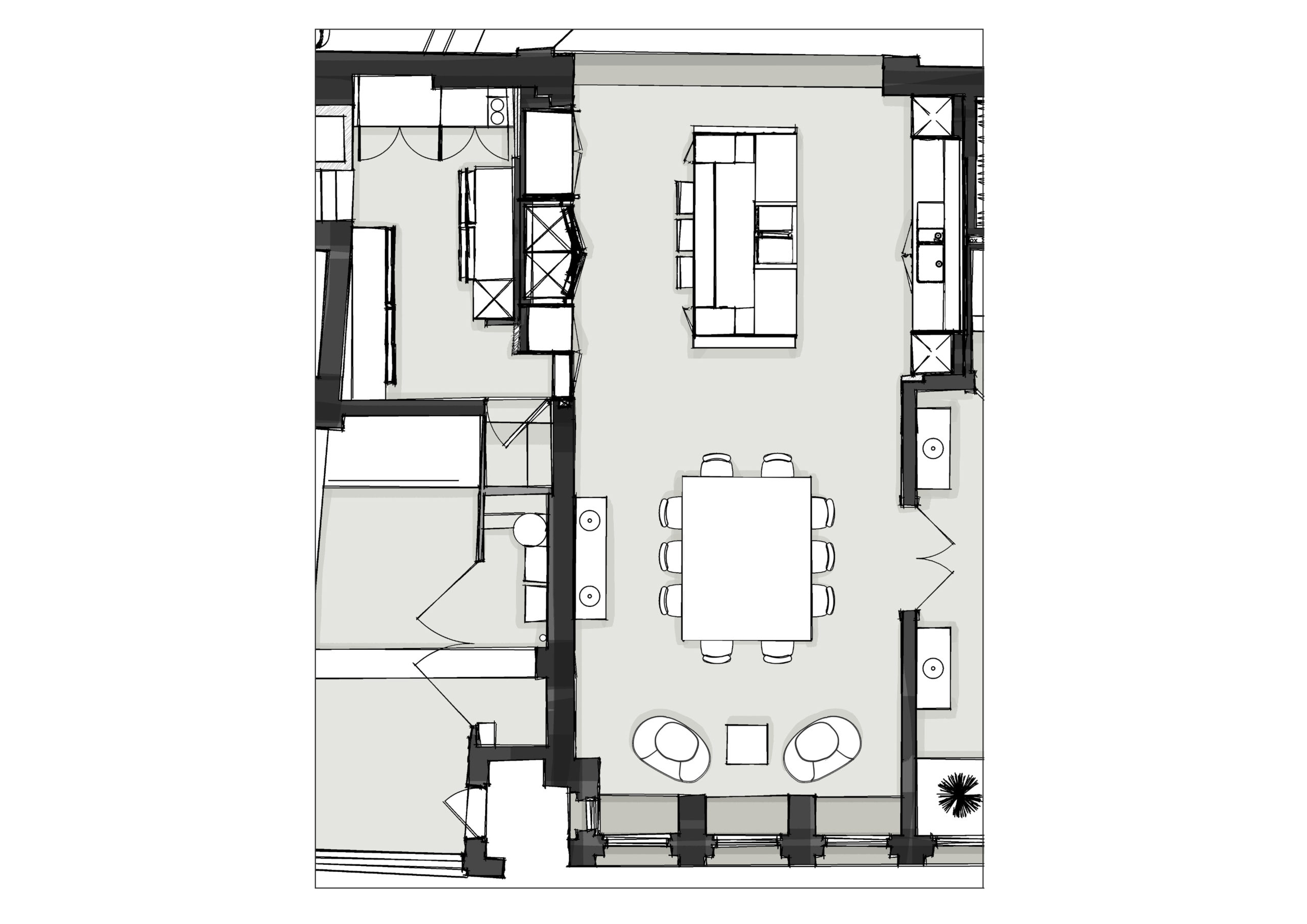
After
It was a stunning home, but the interiors did not flow. Our clients were keen to ensure it remained first and foremost a family home for them and their two children so also needed to be comfortable and relaxing.
Like most nowadays, our clients love to spend time reading a paper while having a coffee, so a social kitchen and dining space was a must. The house had beautiful oversized Georgian Sash windows at the front & a large window wall to the rear, however both rooms still felt dark. By removing the dividing wall between the kitchen and dining room we were able to maximize light and give a dual aspect to the space, both now flood the room with plenty of natural light & form the perfect spot to relax in, both morning & afternoon.
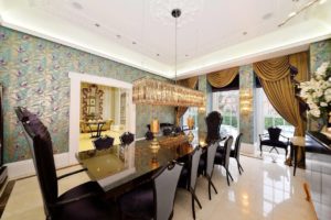
There were beautiful architectural features everywhere, but they were hidden behind overly ornate drapes and wild wallpaper. The interior style just jarred with our client’s and they wanted to modernize whilst showing off the traditional features to the best effect. The most obvious case in point, were the doors to the entrance hall which had stained glass panels which were hardly noticeable with the busy wallpaper surrounding them.
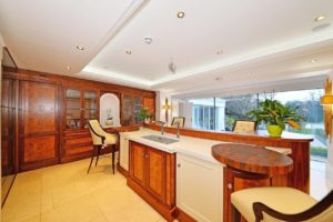
BEFORE
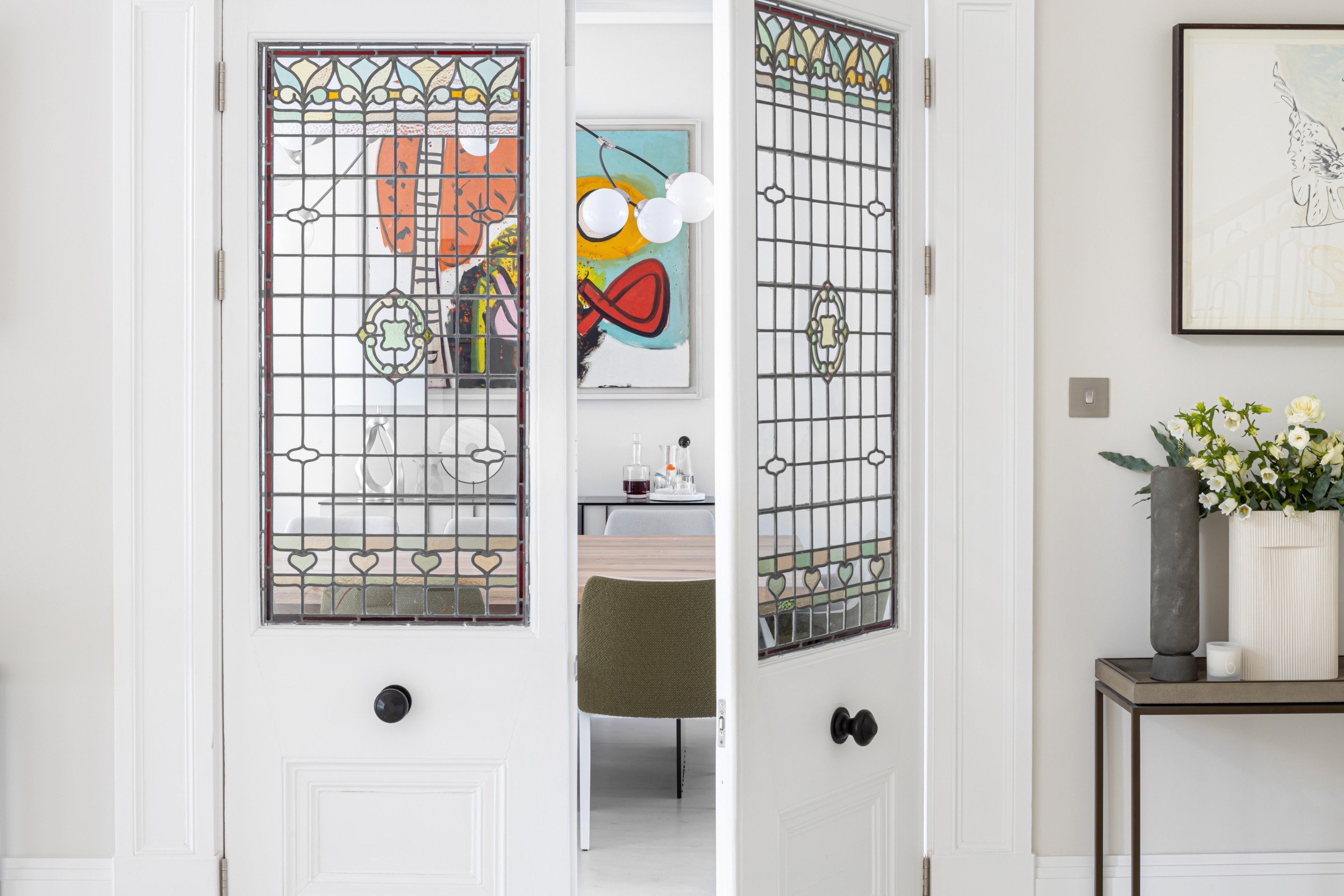
Now with a plainer décor the gorgeous glass really takes center stage. By opting for simple window treatments, you can now really appreciate the architectural details and stunning proportions of the property.

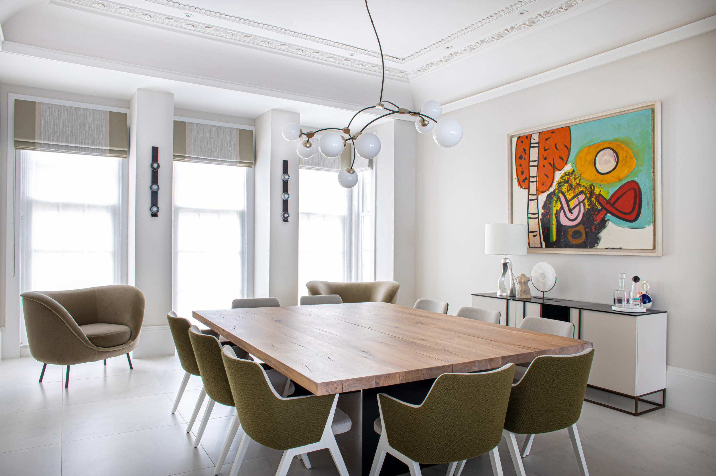
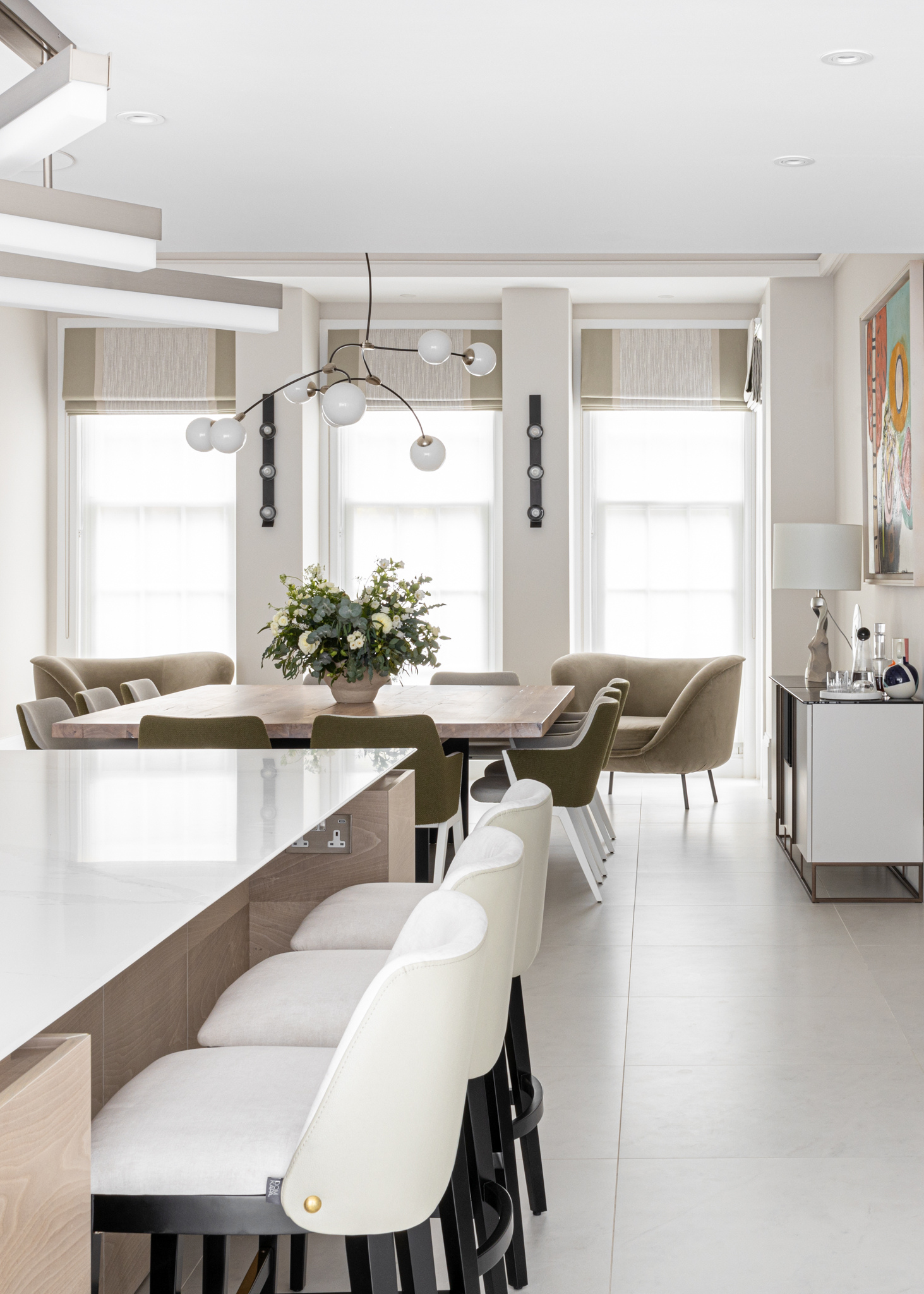
Entering the newly formed kitchen/dining room through original stained glazed double doors, you are faced with a bright & open dual aspect room. In front of you is a large square dining table to seat up to 10 people, perfect for entertaining, and beyond a large dual sided kitchen with a central island unit, with social stool seating.
We used large format marble look flooring from the hallway into the kitchen and dining space to all the space to flow much more seamlessly. A more neutral based was used for the colour scheme with the furniture, soft furnishings and accessories adding accent colours and warmth.
We worked with Roundhouse to design a relaxed family kitchen with plenty of storage, including a hidden door within the cabinetry to the panty, and a wide breakfast station which is perfect for those busy family mornings. The bespoke cabinetry features a contemporary slimline Shaker style door, painted in the classic Little Greene French Grey mid-162, with a contrast island in a Custom Book Matched Walnut veneer, all finished off with a Silestone Calacatta Gold worktop with Sharknose Edge Detail on Island.⠀
BEFORE
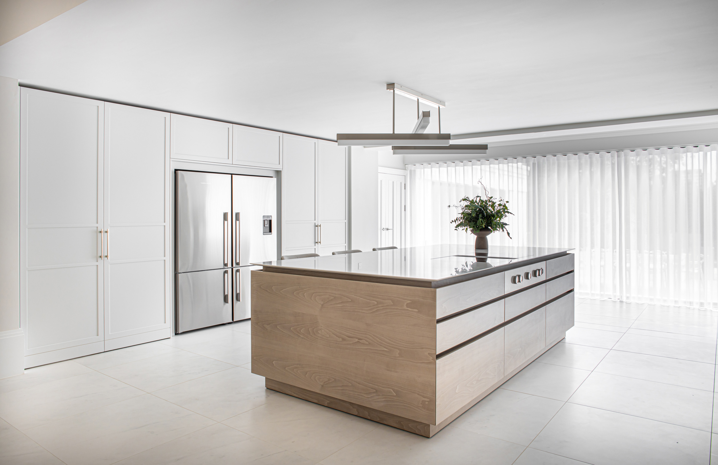
By reconfiguring the space and maximizing the natural light & bright feel with the use of the soft palette, our clients now describe this room as the heart of the home.
If you need help with reconfiguring you home or would like to know more, we would love to hear from you. Pease get in contact with us in the studio on 0121 809 9993 or enquiries@creamandblack.co.uk
