Posted: Wednesday 1 April 2020
Our Guide to Interior Styling

Towards the end of 2019, we revisited previous projects that Cream & Black had specified in the previous year. It’s always exciting as a designer to revisit a completed project & see them in all of their neat & clean glory. If you’re a designer, you’ll be able to relate to the fact that the majority of time spent on a project is sporting site gear & multiple trades working around you. Our clients on these particular projects were property developers, whom were to sell these on after completion to the residential sector.
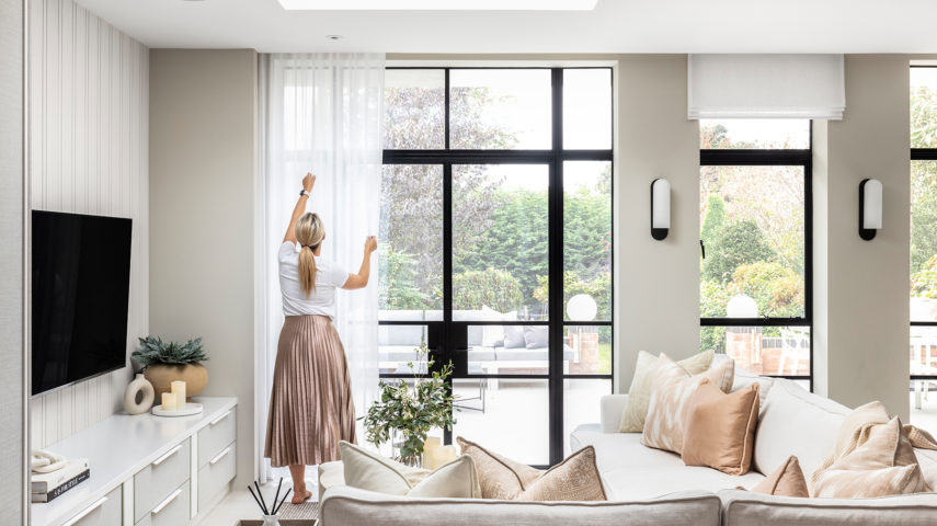
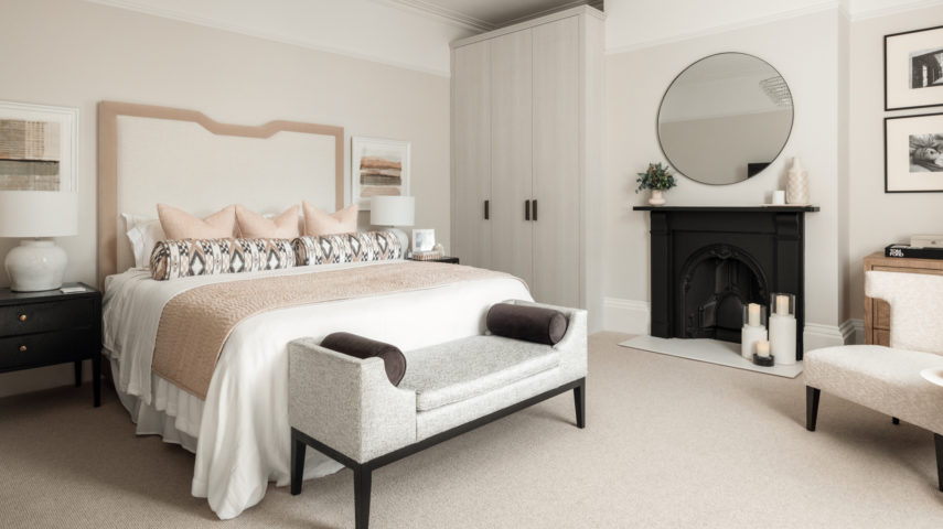
Cream & Black had carefully considered the finishes to complement the overall ambience of the buildings & to appeal to the potential new buyers of the properties. In this instance, we are given a blank canvas to create a whole new personality within the space – which is where we start on our explanation to interior styling.
Similarly, to when we move into a new place – be that our student halls or our first home, we are given a totally new beginning. Albeit, there may be dated wallpaper on the walls & uncertain stains on the carpets, but once we have freshened up our canvas it’s time to convey who we are within our homes. Interior styling is much like our fashion sense & will send a message to who we are as a person & what our passions or experiences may entail.
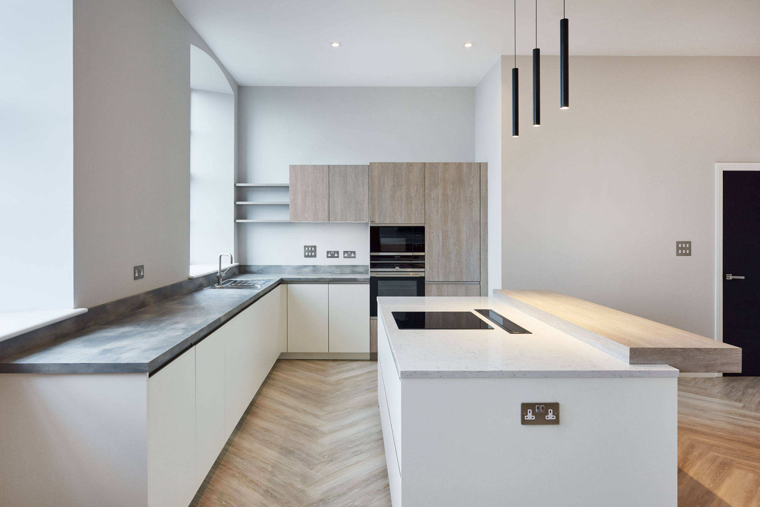
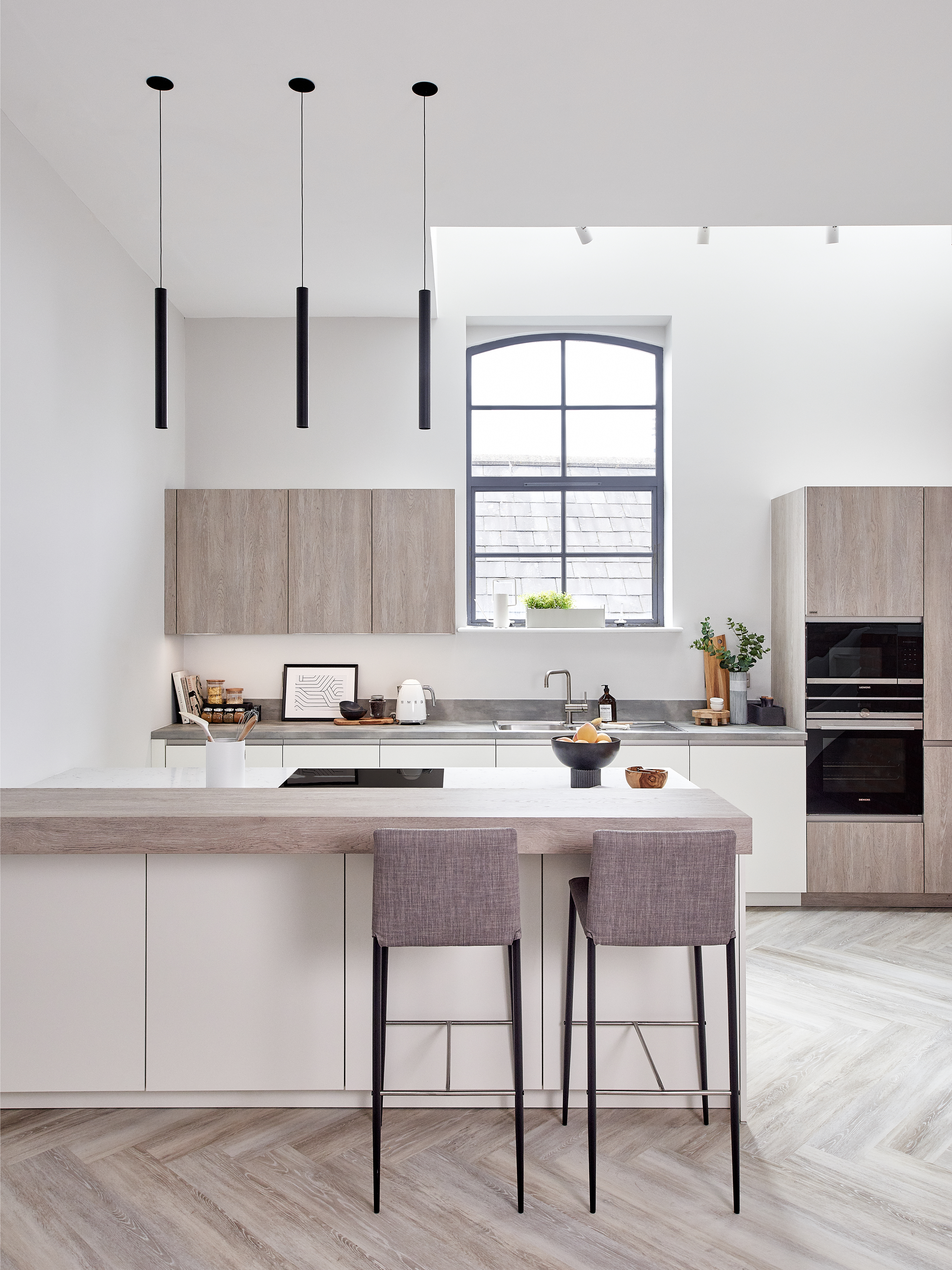
In this particular instance, our client’s target market was aimed for young professionals. Based within Birmingham’s Gun Quarter, this particular district is close to some great bars & restaurants as well as easy access to the city. When we begin to style for this space, we considered who exactly is going to buy this place? We created a false personality; a young couple that appreciated design brands; enjoyed cooking & had culinary experiences from their travels. A slight minimal style, but still had a taste for bold artwork.
Once we begin to understand the personality of whom we are trying to emulate within the space, we create a shopping list of items to use for the photo shoot. We imagine shots & how we will depict those scenarios that we’d like to recreate. On site, the installation – even for a photo shoot – is no easy task. It’s a day, that will require a lot of steps & a lot of coffee!
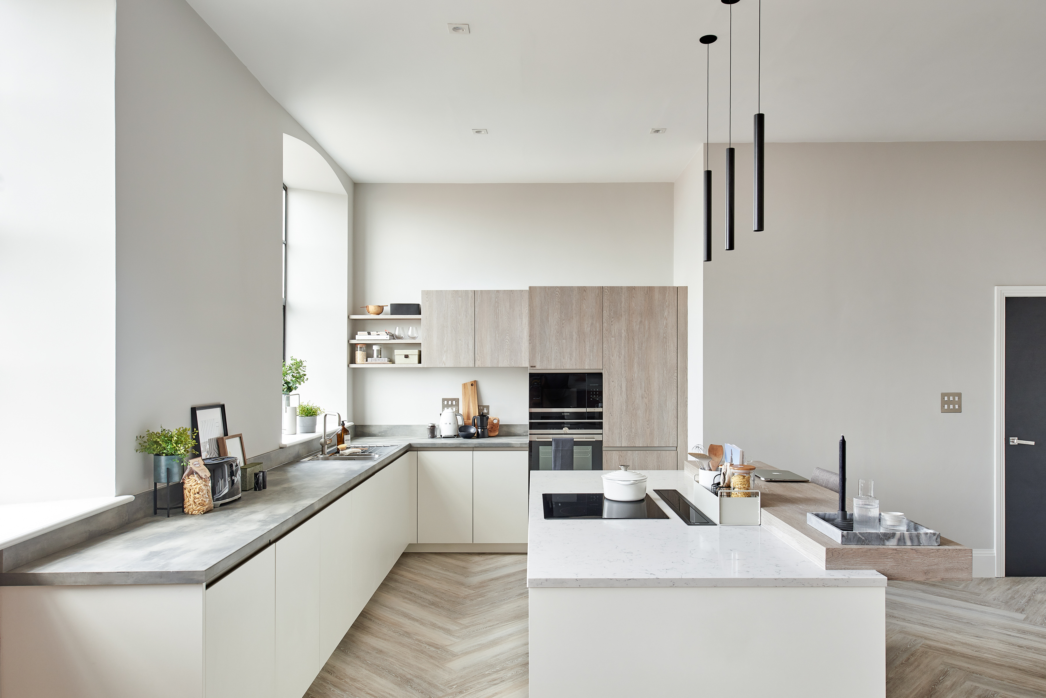
We wanted the styling to be realistic, but also considered for the shot. In the kitchen, we purchased accessories suitable to the personalities & placed items as though the cleaner had just left the room. It can be really creative to take site photos in a realistic ‘at home’ sense; think IKEA catalogues & how they will have toys & clothes chucked around the room set. This is ‘considered’ styling so, as an audience, we engage with the realistic ‘mess’ within our day to day homes. The purpose of these images was to attract a particular clientele to purchase an urban apartment.
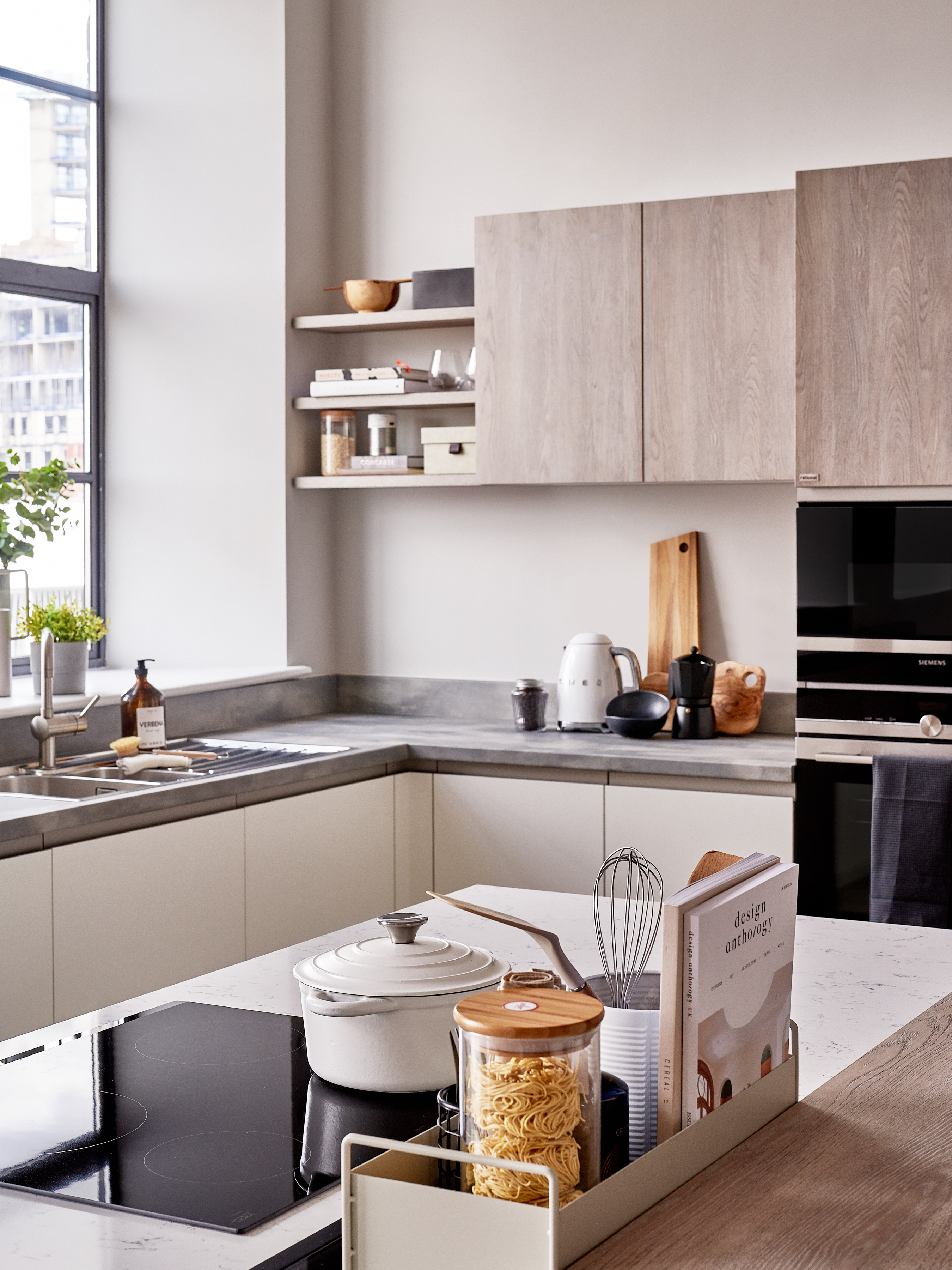
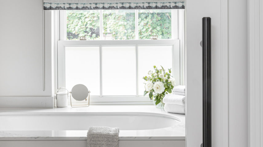
On this particular set, we worked alongside Birmingham based photographer, @Richard Kiely. Known for his skillset with architectural, interiors & lifestyle photography. Needless to say, we were more than pleased with the photography produced & the scenes which he managed to encapsulate. We wanted to get a mixture of overall shots to depict the layouts, as well as some focal imagery of the styling vignettes. Collectively, these gain insight into the detail which can occasionally be overlooked when we first enter a space – but make all the difference.
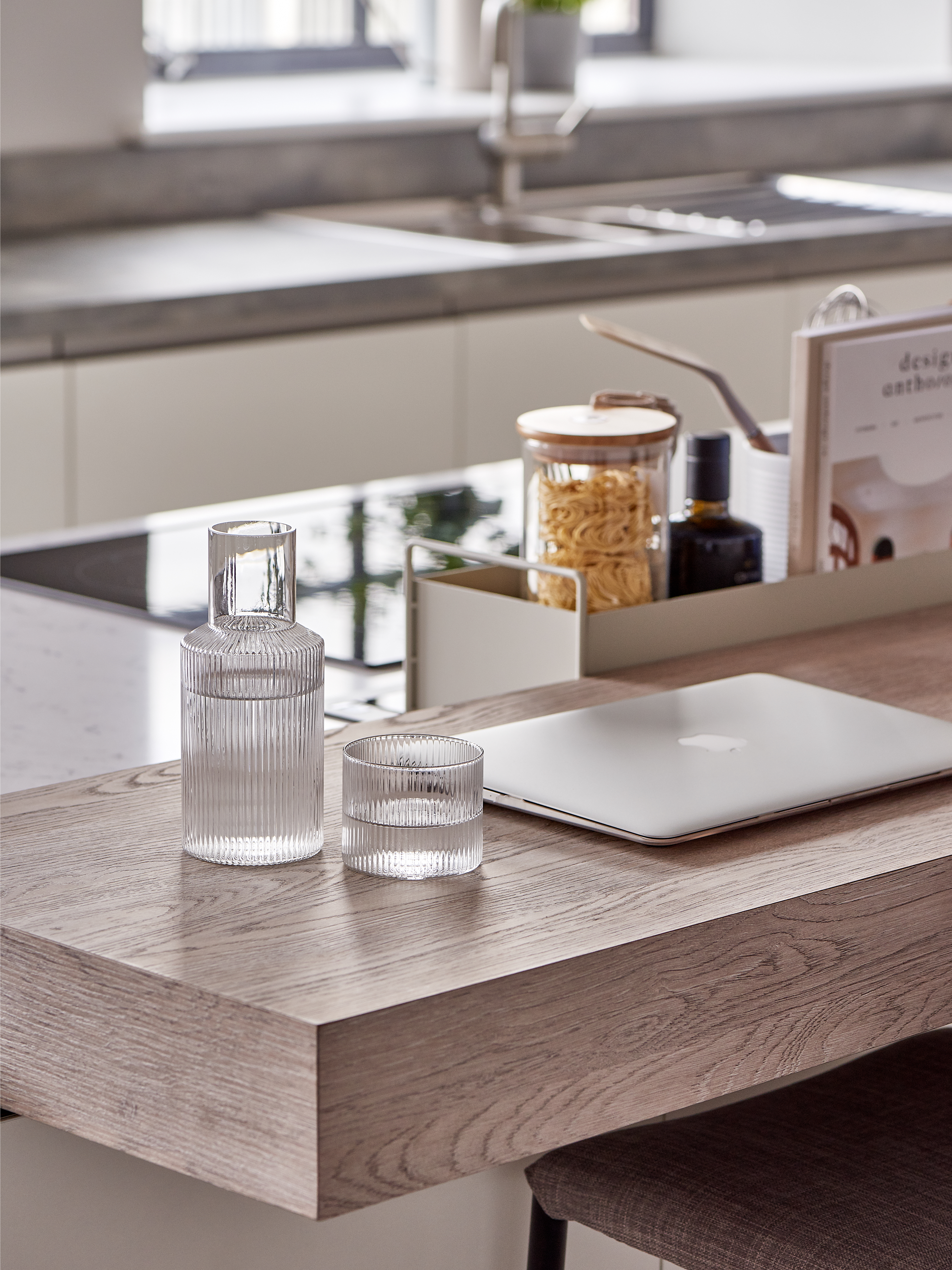
We loved choosing & shopping for the accessories for this photoshoot. KIN home based in Moseley, Birmingham, supply so many products perfect for the style & vibe which we were heading for. Brands such as Ferm Living, HAY or Iris Hantverk always create products reflective of their Nordic backgrounds.
